

Overview
ROLI's welcome series, abandon cart, and win-back flows hadn't been touched since the rebrand 18 months earlier. The emails reflected the caution of that period: compliant, considered, but behind where the brand had since grown. The expression had become warmer and more playful. The emails hadn't moved with it. Open rates had plateaued.
The brief was a full visual and structural refresh, built so one designer could hand it off and the CRM team could run it without rebuilding from scratch every time something changed.
No existing design workflow
CRM platform limitations
2-week hard deadline
Insights that shaped the work.
01 Email as a modular system
Each email was built in isolation. There was shared component logic, but it was never designed for flexibility. Each update meant rebuilding every template from scratch. That created inconsistencies, compounding design debt, and a production process that didn't scale beyond Figma.
02 Bounce rate
Heatmap data showed recipients weren't clicking the CTA and leaving without converting. The primary action was buried in the fourth paragraph. Most people never reached it. In addition to this the full CTA was not clickable only the text.
03 Email Clients
The brand's custom typeface wasn't rendered by Gmail. Every email fell back to a system font, quietly undercutting the visual identity on the platform where most subscribers were reading.
04 Brand Drift
Eighteen months of updates had left the emails behind. Type scales were rigid and outdated. Colour use was inconsistent. Photography no longer matched the brand's tone.
05 Flexibility
The old system couldn't accommodate anything outside the standard template set. Brand partnerships, promotional moments, intentional rule-breaking: each became a bespoke one-off that couldn't be reused or adapted.
06 Figma to Claude workflow
I spotted the potential, from a design perspective, to overhaul our in-house workflow. No more hiring an HTML developer just to turn Figma designs into Klaviyo templates. We'd recently migrated from Mailchimp to Klaviyo, making it the ideal moment to streamline the process.

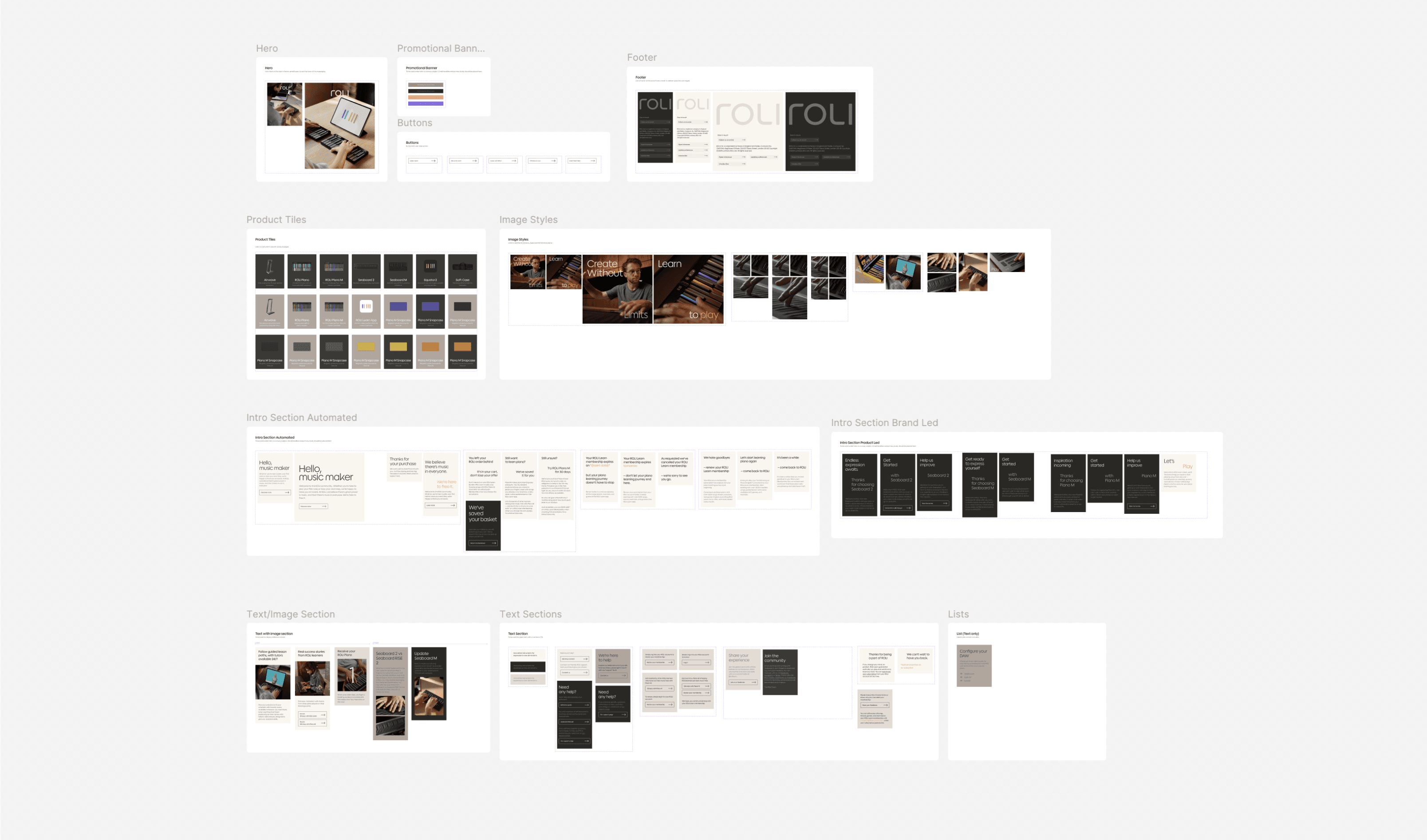
I started with the system, not the templates. That meant defining a modular component library first: type scale, colour tokens, button states, image treatments. Once the components were solid, I used Claude to generate layout variants directly in Figma through the plugin API. It compressed weeks of exploration into days and kept every output within the same design language from the start.
Every decision was stress-tested against one question: can the CRM team maintain this without a designer in the room?
What I did
Modular components
Defined process for future iterations
AI-assisted html writing
AI enabled handoff documentation
What I avoided
Decorative redesign
One-off templates
Bespoke layouts that couldn't scale


What I explored before committing.
I tested three structural directions before committing: dense editorial layouts, minimal single-column flows, and hybrid modular grids. Anything that required a bespoke content decision at the template level was ruled out. If a layout couldn't flex across different copy lengths and image formats, it wasn't the right layout. The goal was a system where variation came from the components, not from custom builds.

The traditional route would have been to design in Figma, hand off to an HTML email developer, and iterate through them every time a stakeholder wanted a change. Instead, I used Claude Code to build the templates directly in Klaviyo's HTML editor, working from the component system I had already designed. That removed an entire stage from the original process.
It also meant I could send live test emails to stakeholders for approval at every stage, in real inboxes, across real clients. No static mocks. What they reviewed was exactly what would send.
Building modularly inside Klaviyo came with constraints, background colour being the main one. The solution was to treat each email differently based on how often it needed to change. Automation flows were split into three blocks: header, body, footer. These don't change often, so the design could be considered and polished without the overhead mattering.
BAU emails needed more control. The body was further divided into independent sections so the team could swap, reorder, and update content reactively without touching anything structural. Playful where it could afford to be. Flexible where it needed to be.

Outcome
Three months after launch the system was running across all flows. The CRM team were building and sending independently, with design giving QA and approval as support on every campaign.
+22%
open rate uplift on welcome series
+18%
click-through on abandon cart
7 flows
live in 3 weeks, on schedule
-2 hours
per week
If I were starting this again.
I would have audited Klaviyo's rendering constraints before opening Figma. A few early design decisions needed reworking once I hit platform limitations, and that cost time I hadn't planned for.
I would also have defined the photography rules earlier. Image treatment became the most debated part of the handoff because it required judgment calls the CRM team didn't feel confident making independently. A one-page visual reference at the start would have prevented that friction entirely.
NEXT PROJECT
ROLI