Client, Website Resdesign
Partnering with professional services firm to rethink the digital experience of one of their flagship platforms.
Services
UX/UI
Creative Direction
Strategy

Understanding the brief
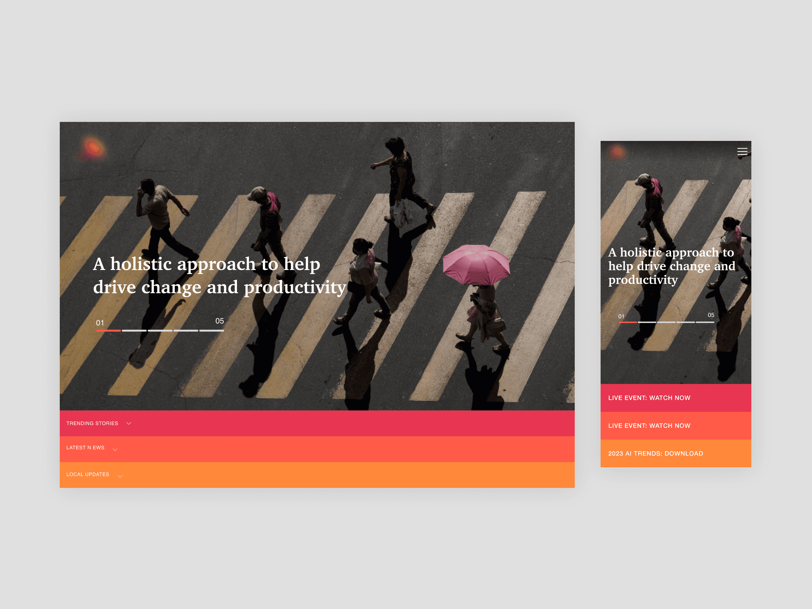
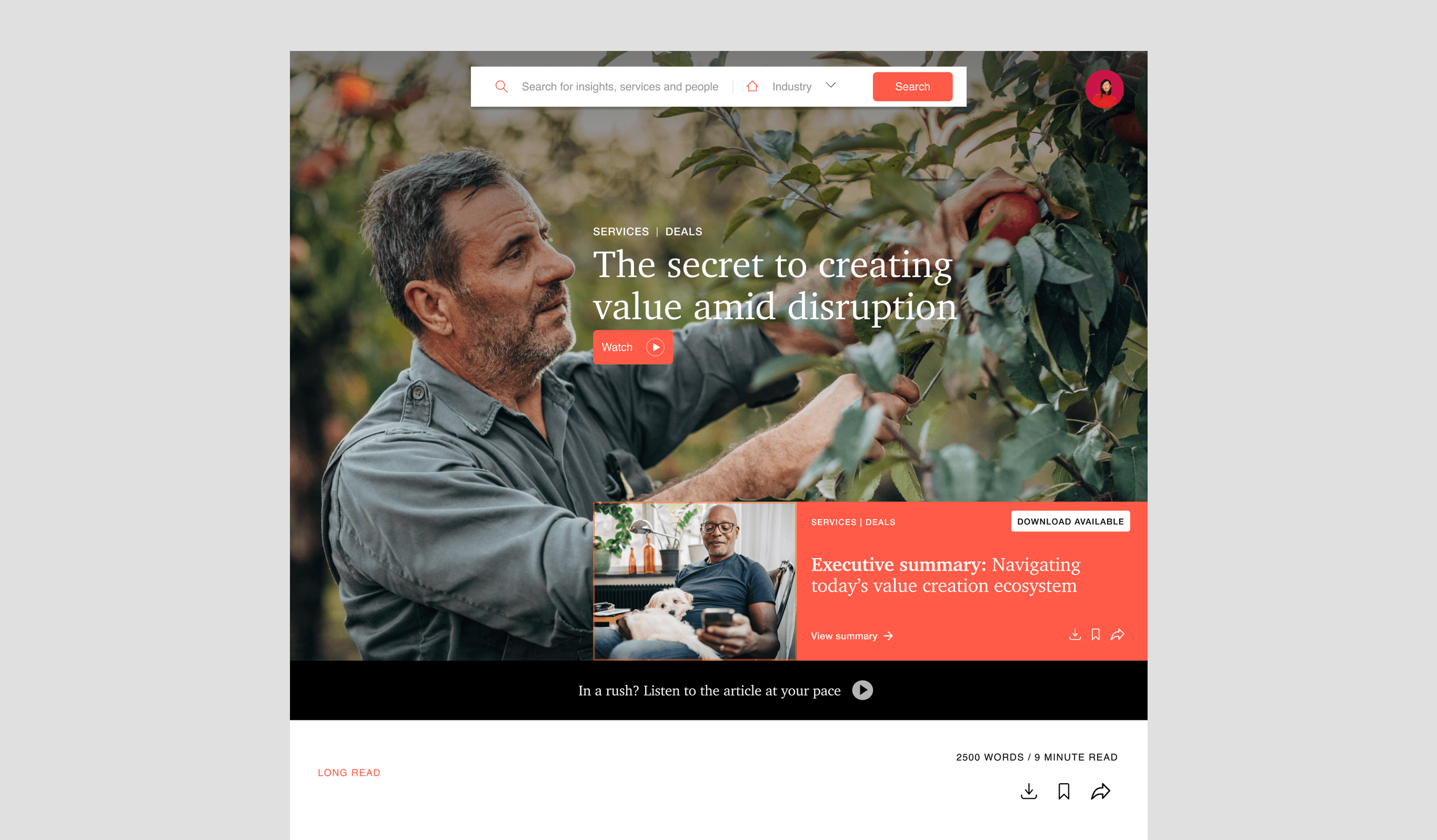
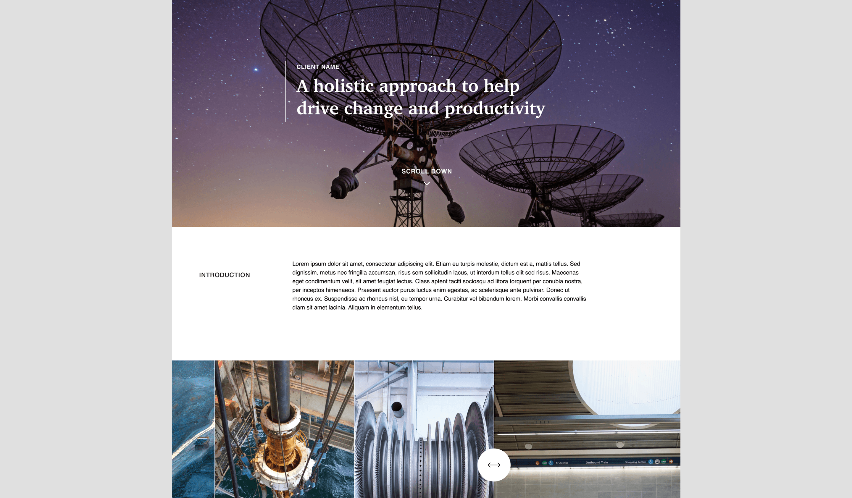
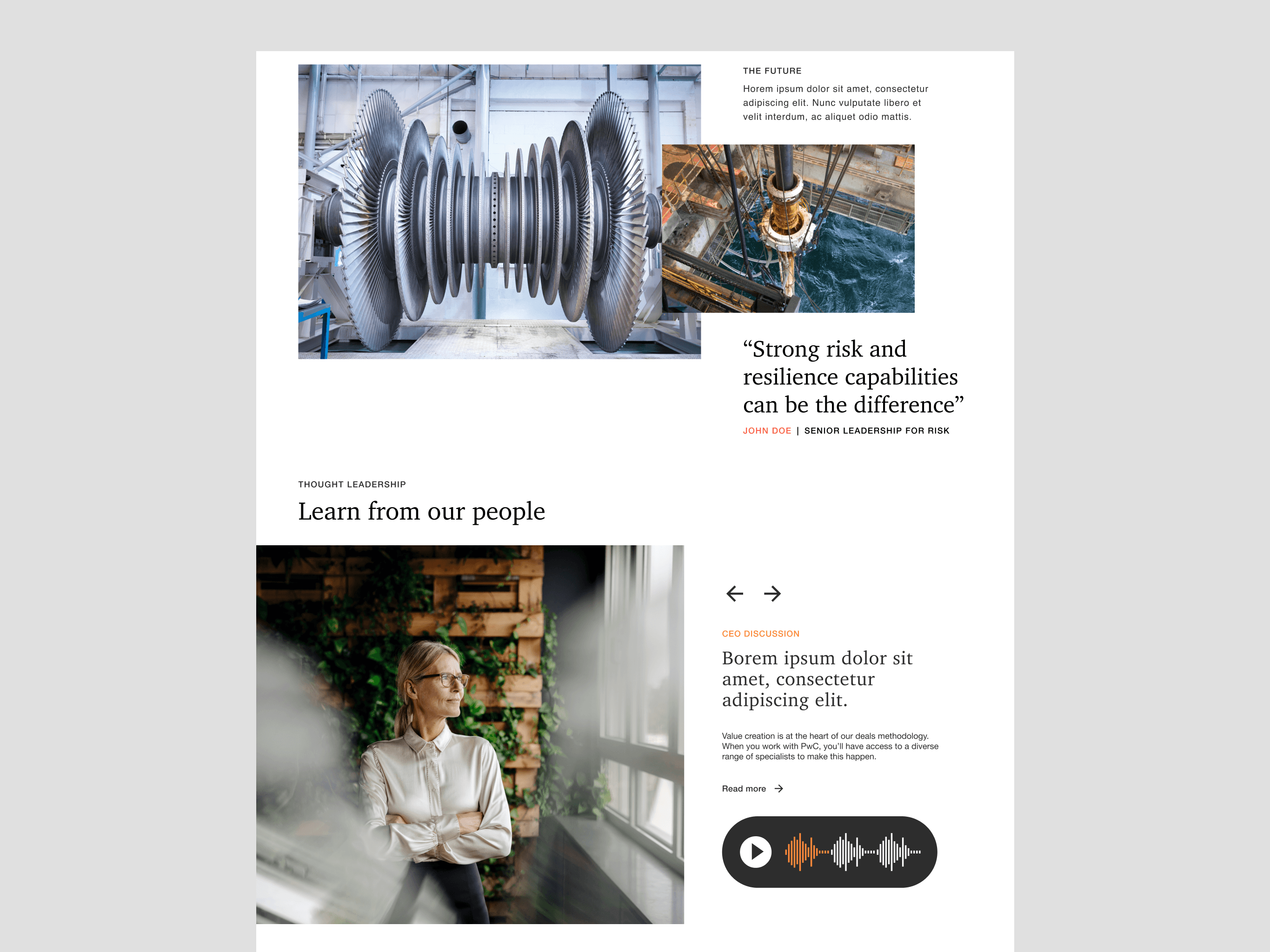
A content ecosystem designed for depth, flexibility, and future growth.
We partnered with a global professional services firm to rethink the digital experience of one of their flagship platforms—a vast knowledge hub used by clients across industries. The site had grown organically over time, resulting in a fragmented experience that made it difficult for return users to navigate. Our task was to bring editorial clarity, intuitive structure, and a timeless visual language to a complex ecosystem of content.
The Challenge
The Research
Building consensus through workshops and research for a user-focused solution.
We kicked off with stakeholder interviews and a series of workshops to uncover pain points in navigation, taxonomy, and content prioritisation. These collaborative sessions provided deep insights into the needs of various internal teams, aligning on goals and expectations for the redesign. We also conducted heuristic audits to assess the existing structure. User testing revealed that returning visitors—often industry experts—struggled to find relevant insights quickly. Benchmarking included both direct competitors and high-performing editorial platforms like The New Yorker and Monocle, which helped us understand how to build credibility while inviting exploration.


The Insight
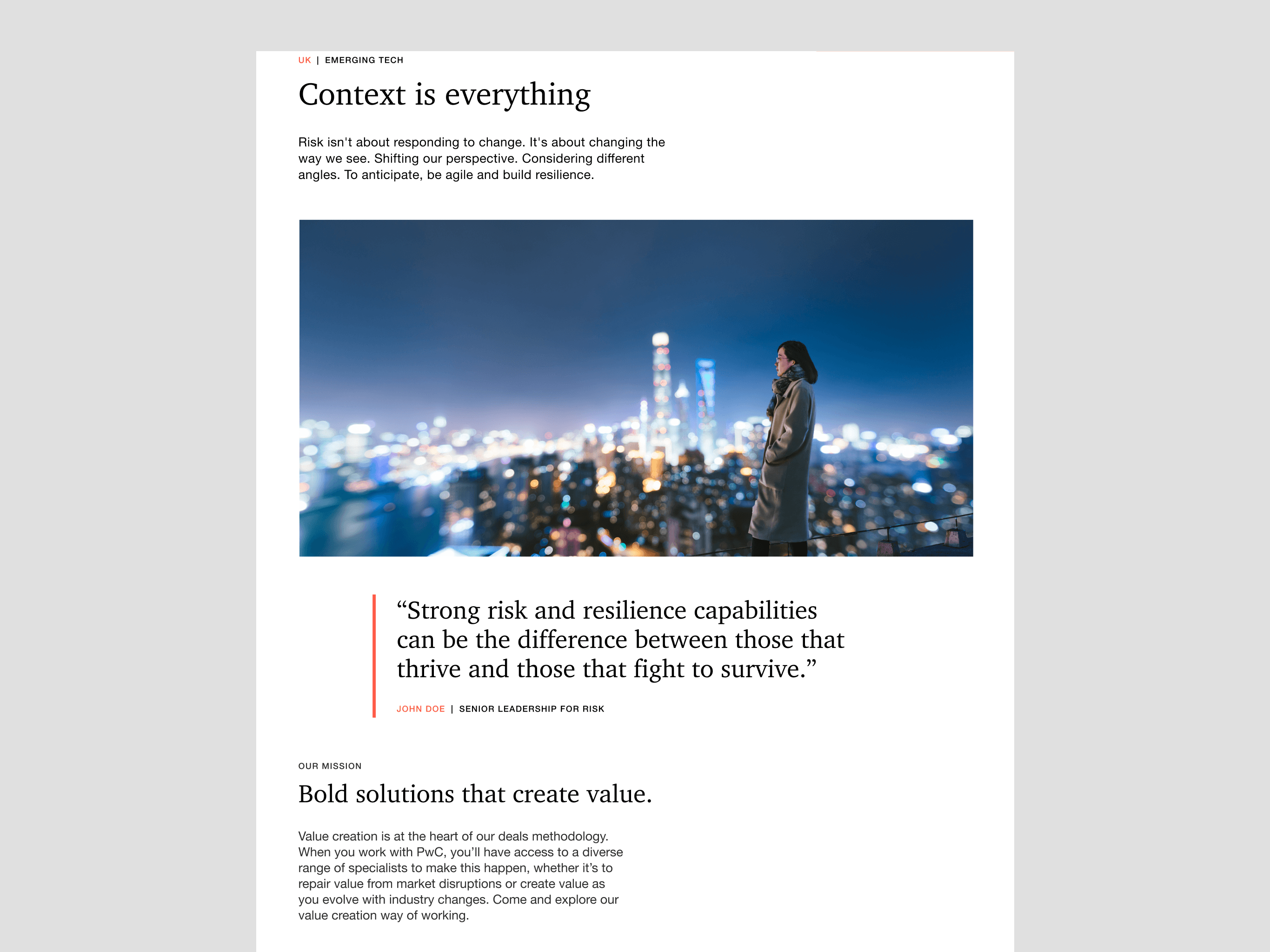
Users didn’t want to "browse"—they wanted to orient themselves quickly within their industry or interest area.
Trust was built not just through branding, but through design decisions: whitespace, hierarchy, and clear signposting.
A flexible design system was key. The platform had to support everything from deep-dive articles to industry snapshots, and scale seamlessly across different service lines.
Editorial thinking was the unlock: by designing like a publisher, not a corporation, we could elevate expertise without overwhelming.